Web Design Project

Type & Scope:
The project was a one-page portfolio website composition made for mobile, tablet, and desktop, made for an ethical, sustainable, fair-trade, fair labour chair-making business. Scope of deliverables for this project were the 3 different sizes of website for 3 different devices, as well as product photos, headshot photos, and logo for 3 different devices.
Role:
I was the designer of this comp and asked for feedback from the client.

Overview:
Yolanda Lopez, owner of Sit Conmigo and my client, needed a website where her clients could pre-order chairs, see her mission statement, and find ways to contact her.
Goals & Problems Solved:
Goals for this website comp were to show photos of Sit Conmigo’s products, invite clients to pre-order products, and show the owner’s dedication to sustainable, ethical, fair-trade, and fair labour products. Problems solved with design were creating a comp that fit all device sizes, displaying Sit Conmigo’s products, a way to pre-order products, contact info, mission statement and colours signifying a dedication to making products that are ethical, sustainable, fair-trade, and fair labour.


Design Process:
Step one of the design process was to make three wireframes, one for mobile, one for tablet, and one for desktop, with shapes to mark where text, photos, logo, and social media icons would go. A grid is activated in this step as well, to align content so that there is plenty of space around each section, and between elements.
Colour palette creation was to find colours that fit the theme of the website. A little bit of research on ethical, sustainable production yielded the colours blue and green, and Yolanda said in her brief that she wanted something that creates excitement but doesn’t distract from her chair’s photos, so I chose reddish as the third colour.
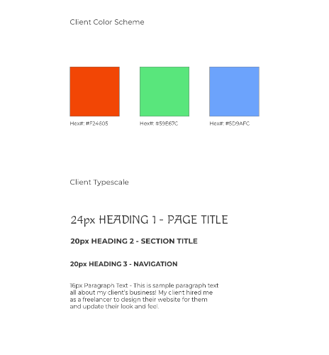
Font pairing was finding a font pair. I chose Macondo font for the title because I thought it fit with the theme of sustainable and ethical, and I used Montserrat for the headings and other text content as I thought a sans serif font also fit with the Sit Conmigo theme.
Content import process was to bring all the media images in, so all the sample images, the photographer’s headshot, the social media icons, and the logo. I had to copy, resize, and place those two more times as there were three wireframes to work with.

Layout process was to decide placement and pattern. Logo, title, and navigation should always go in the header, of course. In the about section, I put Sit Conmigo’s mission, but I accidentally forgot to put the owner’s photo. In the work section, I decided to stack Sit Conmigo’s product photos in a 2 x 2 grid. The contact section contained Sit Conmigo’s owner photo, phone and e-mail on the left side, and social media icons on the right side.
Challenges & Takeaways:
Challenge number one: more whitespace. Challenge number two: the original colours I went with did not show up very well against the background. I ended up going with darker colours to make it show up better against the background. Instructor feedback was a great help with making positive changes for accessibility reasons, as well as visual contrast.
