Web Design Project

Type & Scope:
The project was a landing page for the coffee shop The Whole Bean, owned by Karla Kahvi. Scope was a landing page comp, logo, four social media icons, and three photos.
Role:
I was the designer of this comp and asked for feedback from the client.
Overview:
The Whole Bean’s owner needed a landing page to get word out about the coffee shop’s grand opening. The landing page needs to get word out about the coffee shop’s grand opening, display a call to action, what the coffee shop offers for products, and contact information.
Goals & Problems Solved:
Project goals were to announce the coffee shop’s grand opening, display contact information, shop offerings, and call to action. Problems to be solved were acquiring client e-mails, displaying contact information and shop offerings, and making the grand opening announcement.
Design Process:
Step one of the design process was to make one wireframe with shapes to mark where text, photos, logo, and social media icons would go. A grid is activated in this step as well, to align content so that there is plenty of space around each section, and between elements.


Colour palette process was to pick colours that fit the theme of the website. The message I wanted to convey with this page was friendly and inviting. The colours I picked were orange for cheerful, yellow for warmth, and grey for calm.
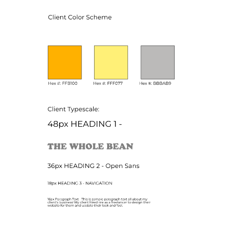
Font pairing was to decide on a font pairing that would be readable while putting forth a cheery, welcoming atmosphere. I picked Cooper Std for the title and all-important call to action button, and Open Sans for the paragraph text.
Content import process was to bring all the media images in, so all the atmospheric images, the menu and product icons, the social media icons, and the logo. The logo and menu and product icons I made earlier in the design process. The atmospheric images I picked out from a free stock image site called Unsplash, and the social media icons came from a site called Font Awesome.
Layout process was to decide placement and pattern. Logo, title, and navigation should always go in the header, of course. The call to action section held 3 photos side-by-side above the text. The signup section held the form for first name, last name, e-mail address, and signup button. Also in that section was the menu and product listings, with a couple icons. The contact section held the Whole Bean’s address, e-mail, and phone number on the left, and social media icons on the right.
Challenges & Takeaways:
Challenge one was whitespace, as per usual. Challenge two was alignment to the grid and the rest of the content. Challenge number three was making sure the logo fit with the rest of the landing page, giving a friendly and inviting vibe to the page. Takeaways were always add more whitespace than you think you need, make sure your content alignment is correct across the whole page, and make sure *all* content, including colours and images, fit the vibe you are going for.